H.A.R.P. Internship Data Science Project
Published:
Proposal
For your reference: I use the word “articles” to refer to all types of contents published by New York Times, including multimedia and more.
With the rise of hate crimes in the United States during the pandemic, I want to contribute to the bigger understanding of Asian-Americans representation on a reputable journal. Whether intentionally or unconsciously, the journalists are responsible for shaping the public view. Therefore, analysis of what type of news about Asian-Americans are reported, what words frequently appear with the Asian-Americans subject can enable other researchers, policymakers to build upon the work and help combat these hate crimes. I choose the New York Times because it has clear documentation of its API.
Process
New York Times API
To collect the articles’ metadata, I have to figure out how to use the New York Times API. There are different types of API, such as Books, Movie Reviews, etc, so I have to read the documentation and do some lower level exploration to choose the API that best fit our purpose. I have used the Article search API with the tag Asian-Americans and filtered it after the date Jan, 21, 2020 because that is the first date reported for COVID-19 cases in the United States. The query I received back will be as followed.

Since there are only 10 articles per pages, I set up the file to parse all the pages. Once I have finished, I build it into a csv file so I can build the dataframe in Python later. Looking at the csv file, I’ve found these subjects related to our topic and worthy to be considered
- ‘subject’, ‘Assaults’
- ‘subject’, ‘Minorities’
- ‘subject’, ‘Workplace Hazards and Violations’
- ‘subject’, ‘Coronavirus (2019-nCoV)’
- ‘subject’, ‘Mass Shootings’
- ‘subject’, ‘Quarantine (Life and Culture)’
- ‘subject’, ‘Discrimination’
- ‘subject’, ‘Demonstrations, Protests and Riots’
- ‘subject’, ‘Murders, Attempted Murders and Homicides’
- ‘subject’, ‘Race and Ethnicity’
- ‘subject’, ‘Atlanta Spa Shootings (2021)’
- ‘subject’, ‘Hate Crimes’
- ‘subject’, ‘Apologies’
Dataset
To convert the csv file into a dataframe, I use one-hot encoding with number 1 meaning the article has this tag, 0 for not. Examples of the first few lines in the frame are shown below. There are headlines, date published, the news desk (which I understand as the category), number of words, 12 subjects I mentioned with one-hot encoding, and the link to the article
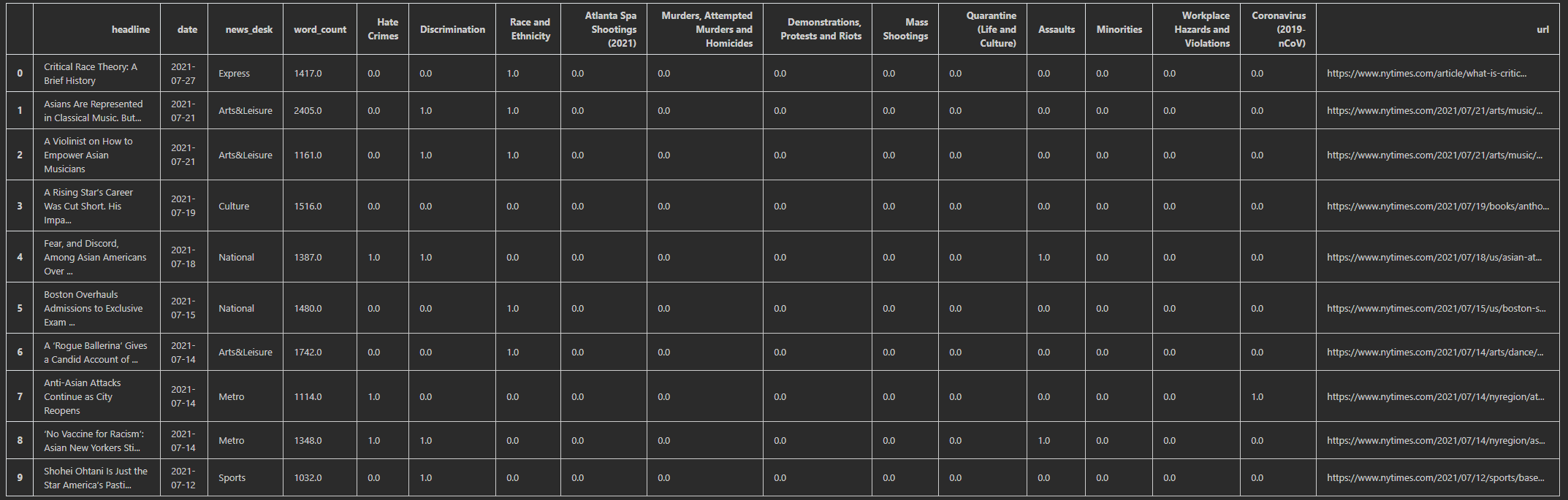 Examples of the first few lines in the frame
I want to explore what the dataset is like, so I’ve explored the average words count, categories count of the “news_desk”, and articles above with no tags.


To merge with the US statistics on COVID-19 cases, I import from the New York Time repository and now the data is prepared to do the visualizations. I convert the cases into percentage of cases in the United States with the population count from Jan 21, 2020 on the US census page.
Visualizations and Analysis
- Create wordclouds for all the headlines and the headlines in the pandemic:
Using the Python library wordcloud, I have generated wordcloud visualizations for word frequency in the headlines of articles with the Asian-Americans tag. It is interesting to note that racism and discrimination related words for Asian-Americans have always been prevalent. It also tells us about the nature of human curiosity and journalism, as it is a well-known, research-backed-up fact that negative articles receive more views than positive ones.


- Create heatmap visualizations:
I’ve update the dataset so the count of the articles with the subject tag corresond to each day so I can run correlation analysis on that. Seaborn is a Python library built on matplotlib to help us visualize this correlation. The analysis shows us that there’s a very high chance that when the percentage of cases raises, there will be more articles published about Asian-Americans with all of these tags. It is interesting to note that the tag that corresponds with the percentage of cases most is the Coronavirus (2019-nCoV) and Quarantine (Life and Culture). I thought it is self-explanatory and also a little ironic.

- Create subject counts visualization:
This plot shows the count of article published with a certain subject. In the pandemic time, it is an almost 50% chance that when an article published with the Asian-Americans tag, it will be about discrimination. I can further do analysis on this with all the Asian-Americans headlines to see if that’s still the case.

Final Thoughts
I’ve enjoyed the process of working with data so far, and I do expect to continue on with other data science project in the future as time permits. With regard to the project, here are some of my learning lessons so far:
Given the data and the world we live in, it’s extremely hard for you to do an entire new project that no one has thought of before. There is always someone who has done a similar thing to a certain aspect of what you’re doing. Always be willing to search and learn more from people before you. When I search online for scraping New York Times articles, I’ve found some great sources to help me get started that I will put in the reference down below.
The majority of time on a data science project will be spent on preparing the data in the right format. There are multiple ways to represent your dataset, so you have to play around, come with an open mind to explore what works for you. There is also no right answer, just what your goals are and what stories you want to tell with the data.
Always ask yourself, “Does this make sense?” When I have to combine the COVID-19 dataset with the headlines dataset, I’ve joined the two sets together first before aggregating the data by date. This leads to the number of COVID-19 cases being doubled, so when I plotted the data, there are random pikes that do not make sense. I only realize my mistakes after reflecting on the visualizations. So as a rule of thumb when working with data, always stop and truly look at the data, the visualizations! Being careful will save you lots of time later down the road.
The amount of data on the internet for us to play with is huge. Explore and have fun!
There is a video presentation that is linked here and all of the information including the presentation slide, raw code, can be accessed online here. It has been a consuming project with a large learning curve. The timeline from start to finish is under one month, so I recognize there might be errors and shortcomings. It is also one of my first exposure to data science project, so feel free to send me a message with improvements, suggestions. I welcome all feedbacks. Please feel free to contact me through Github or visit any of the social media accounts listed on this website. Thank you very much!
Reference for the Statistics
Center for the Study of Hate & Extremism (2020) Anti-Asian Hate Crime Reported to Police in America’s Largest Cities: 2019 & 2020. California State University. Retrieved at https://www.csusb.edu/sites/default/files/FACT%20SHEET-%20Anti-Asian%20Hate%202020%20rev%203.21.21.pdf
Saw et al (2020) Stop AAPI Hate Mental Health Report. Stop AAPI Hate. Retrieved from https://stopaapihate.org/wp-content/uploads/2021/05/Stop-AAPI-Hate-Mental-Health-Report-210527.pdf
Jeung et al (2021) Stop AAPI Hate National Report. Stop AAPI Hate. Retrieved from https://stopaapihate.org/wp-content/uploads/2021/05/Stop-AAPI-Hate-Report-National-210506.pdf